Case study
Pet technology and digital pet healthcare
Furr Baby
Designing trust for a user who cannot speak for itself, across a product that changed category halfway through.
Furr Baby started as matchmaking for pets and pivoted into pet healthcare. I carried the research on trust, identity and proxy communication across that change, and designed both sides of the result: an app for owners and a service cockpit for veterinarians.
Three ways to read this. Pick the one that fits the time you have.
- Role
- Lead Designer
- Duration
- About two months, brand through prototype
- Team
- Startup founder, with veterinarians consulted during the healthcare phase
- Scope
- Product discoveryUX researchInformation architectureUser flowsBrandingOwner appVeterinarian portalDesign systemPrototyping
In four lines
The unusual constraint
The patient cannot describe the problem. Everything the veterinarian learns arrives through an owner who is guessing.
What changed
The business pivoted from pet matchmaking to pet healthcare, driven by funding and evolving startup priorities.
My role
Lead Designer, working with a founder who was still deciding whether the product was an app, a website, a portal, or all three.
The through line
Trust, identity and context carried from one product direction into the other. The research outlived the category.
01 / 11Overview
01 · Overview
A product about trust, told through a product that changed shape
Two directions, one set of learnings, and a design problem that got harder in the best possible way.
Furr Baby began with an ambitious premise: a matchmaking experience for pets. Owners would help their animals find compatible companions. The product later pivoted toward healthcare, because of funding and shifting business priorities.
The interesting part is not that the direction changed. It is what survived the change. Everything the first phase taught me about verification, owner confidence, identity and progressive trust turned out to matter more in healthcare than it had in matchmaking, because in healthcare the cost of misplaced trust is not a bad afternoon. It is an animal that does not get treated.
This is not a pet app. It is a study in designing trust when the user is deciding on behalf of someone who cannot speak.
In a dating product the person filling in the profile is the person being represented. In Furr Baby they never are. That single difference reshapes identity, safety, information architecture and the entire consultation model.
2 Product directions designed
Matchmaking, then healthcare, after the business pivot.
5 Benchmark products studied
Tinder, Bumble and Hinge in phase 0. Practo and Tata 1mg in phase 1.
6 People spoken with
Three pet owners and three veterinarians, named in the project record.
2 Sides of the ecosystem
An owner app and a veterinarian portal, built over one shared pet record.
4 User journeys mapped
New owner, returning owner, veterinarian, and the assisted information path.
9 Areas in the dating teardown
Onboarding through to what a product asks for before people meet.
Positioning it in one line: designing a connected pet care ecosystem by carrying trust, context and human centered thinking from a pet matchmaking concept into digital pet healthcare.
02 · Origin
The brief did not exist yet
A founder who knew there was a business, and had not yet decided what the product was.
The client was a startup founder still exploring whether the business should be an application, a website, a doctor facing portal, or a broader ecosystem. That ambiguity meant the design role extended well past screen design. The work involved helping decide what the product could be, what users might need, and which problems were worth solving at all.
Could a familiar dating model work when the person using it is not the person being matched? I studied the interaction models behind established dating products and started translating them into an animal centered context.
- Secondary research into Tinder, Bumble and Hinge, aimed at interaction models rather than visual style
- A proxy identity model where owner and pet are represented together
- A progressive trust structure spread across onboarding instead of one verification wall
- Interviews with pet owners and a broader attitudinal survey
Funding constraints and the evolving startup direction moved the business toward pet healthcare. The category changed. The central design problem did not, it got sharper.
- Trust and verification became trust in doctors, information and consultation
- The pet profile became a health identity
- Context before a meeting became medical context before a consultation
A two sided platform rather than an appointment booking tool. The pet's record became the shared layer between an owner describing what they see and a veterinarian deciding what it means.
- Owner onboarding, pet health card, chat and video consultation
- Doctor onboarding, service cockpit, patient records and notifications
- Wallet and payment treated as a supporting utility, kept visually distinct from medical information
- An AI assisted summary layer, explored with a human in the loop model
The project record does not confirm which parts of either phase reached production. Rather than blur that line, this case study labels each area by how far it went and flags the rest for verification against the original files.
- Problem
- The neat version of this story would open with a clear brief and a defined product. That version would also be false.
- Decision
- Lead with the uncertainty and show the work that resolved it.
- Reasoning
- Most real product work starts here. A designer who can only operate once someone else has defined the problem is a different and much less useful hire than one who can help define it.
- Impact
- The research is presented as the thing that shaped the product direction, which is what it was, rather than as decoration applied afterwards.
03 · Matchmaking
Phase 0, and the proxy problem
Borrowing a familiar interaction model, then finding out how little of it survives contact with an animal.
The first phase asked whether a dating model could work for pets. I researched Tinder, Bumble, Hinge and other established products, looking at onboarding, identity, verification, discovery, matching, trust signals, safety, how conversations begin, and what a product insists on knowing before two people meet.
The goal was never visual imitation. It was understanding why those interaction models work, so I could tell which parts would transfer and which would quietly break.
Human dating
Pet matchmaking
The user represents themselves
The owner represents the pet
The user states their own preferences
The owner interprets what the pet needs
Identity is direct
Owner identity and pet identity, together
Safety concerns are personal
Safety concerns cover the owner and the animal
The conversation is between the two daters
The conversation is between two owners
The decision to meet is personal
The decision to meet involves animal welfare and owner comfort
Every row in that table is a place where a pattern borrowed from dating stops describing the situation it was built for.
What transferred
The familiar mental models. Building a profile, browsing, matching, starting a conversation. People already know how these work, and that familiarity was worth keeping.
What did not
Human identity does not become pet identity. Human consent cannot be represented as an animal preference. Dating safety patterns are not sufficient when a live animal is going to be in the room. Pet health, behaviour and owner responsibility add context that no dating product carries.
So the profile had to change underneath, not just above. It moved from a conventional dating profile toward a paired identity: the owner establishes who they are, and the pet profile explains who the animal is. Pet name and identity, animal type, relevant characteristics, behaviour, owner information, a pet specific questionnaire, compatibility context, verification status.
That is the difference between a reskin and a redesign. The information model changed, which means the discovery, matching and safety systems built on top of it all had to change too.
Asset needed
The side by side benchmark board: each borrowed dating pattern next to the Furr Baby interpretation, annotated as borrowed, adapted or rejected.
This exists as reasoning in the project record but not as an exported artifact. It is the single most useful missing asset in this chapter, because it shows the judgement rather than describing it.
04 · Trust
Trust, built in checkpoints rather than walls
The strongest recurring theme in phase 0, and the reason the research survived the pivot.
An owner considering a meeting faces uncertainty at several levels at once. Who is this person? Is the pet real? Is any of this information accurate? Is the meeting safe? Is the whole interaction appropriate?
The obvious answer is a verification wall. Ask for everything up front, prove everyone is genuine, then let people in. The obvious answer is also the one that empties the product, because nobody completes a long identity check for a service they have not experienced yet.
This is a design framework I built from the research, not a measured model. It orders the moments where the product asks for something against the moments where it has earned the right to ask.
The principle underneath it: trust should be visible at the moments where the user is being asked to take a risk.
Not on an about page, not in the footer. At the point of the decision, which is the only place it can change what someone does.
Onboarding therefore had to do two contradictory things. Collect enough information to build a profile credible enough to be useful, and stay short enough that people finish it. The resolution was to spread the collection across the journey and give every request a reason, so that each step reads as the product being careful rather than the product being nosy.
- 01
Collect without overwhelming
Useful information, split across steps small enough that none of them looks like a form.
- 02
Make verification understandable
A check nobody understands reads as an obstacle. A check that explains itself reads as protection.
- 03
Explain why
Every request answers the implicit question the user is already asking, which is why do you need this.
- 04
Keep progress visible
People tolerate a longer journey when they can see where it ends.
- 05
Build trust incrementally
Small commitments before large ones. The product earns each request with the one before it.
- 06
Prepare for discovery
Everything collected has to be worth something later, or it should not be collected.
05 · Research
What owners actually said
Three interviews and a broader survey, reported at the level the evidence supports.
Kapil, with Mike
Software professional in a leadership and operations role, Mumbai. Mike is an energetic bulldog.
ObjectiveUnderstand what would make an owner comfortable arranging a meeting between their dog and an animal they have never met.
5 questions explored
- How would you go about finding a compatible companion for Mike today?
- What would you want to know about another owner before agreeing to meet?
- What would you want to know about the other animal?
- What would make you decide against a meeting?
- What information about Mike would you be willing to share?
Convenience was the entry point
The appeal was a simpler way to find a compatible experience for the pet. That is what gets someone to open the product.
Confidence was the actual gate
Interest in the idea and willingness to arrange a meeting are two different states, separated by how much he trusted the other owner.
Structured information mattered
Unstructured description was not enough. He wanted the sort of detail that lets you form a judgement rather than an impression.
So whatDiscovery could be optimised for convenience, but the step before a meeting had to be optimised for confidence. Those are different screens with different jobs.
Shrishti
Cat owner, interested in the social and emotional side of the concept.
ObjectiveUnderstand whether the value of the product is owner convenience or something the animal gets out of it.
4 questions explored
- What would you hope your cat gets out of meeting another animal?
- How do you feel about the idea of a matchmaking product for pets?
- What would make the experience feel comfortable rather than strange?
- Who would you talk about this with, and who would you not?
The value extends past the owner
A positive interaction creates a more engaging experience for the pet, not only a convenient one for the person arranging it.
Emotional value is real value
The reason to use the product was not purely functional, which changes what the copy and the framing have to do.
Comfort is a design requirement
The experience needed to feel non judgemental. An owner who feels slightly silly using a product stops using it.
So whatFraming became a design surface rather than a copywriting afterthought. This is visible in the shipped match screen, which celebrates a playdate rather than a romance.
Content needed
Interview 03, with an owner experienced with both dogs and cats. Participant identity and findings need to come from the original notes.
The conversation happened. Reconstructing what was said in it from memory would make every other quote in this case study worth less.
Content needed
Verbatim quotes from all three interviews, pulled from the original recordings or notes.
The insights above are my synthesis of the conversations. Nothing here is presented in quotation marks, because nothing here has been checked against a transcript.
The survey
A split reaction, and a more useful question underneath it
A broader survey explored how people reacted to the idea of pet matchmaking. The reaction divided: some found the concept unfamiliar or faintly taboo, others were genuinely excited by it.
The useful finding was not the split. It was what moved people across it. The question worth designing against turned out to be not would you use this, but what would make you comfortable enough to consider it.
Theme
What it meant for the design
Trust
People need confidence before connecting with strangers, so trust signals belong in discovery and not only in onboarding.
Pet welfare
The experience cannot feel like a novelty at the animal's expense, which rules out a lot of otherwise tempting playfulness.
Identity
Owner information and pet information have to work as one unit, because neither is credible alone.
Convenience
Finding a relevant match should not feel like work, or the trust built earlier never gets used.
Social comfort
Clear framing and context normalise the idea. This is why the product talks about playdates.
Content needed
Survey sample size and response percentages.
The survey ran, and the themes above came out of it. The numbers are not available to me, and a percentage invented to make a chart look convincing is exactly the kind of claim that collapses under one follow up question. The themes stand on their own.
| Proxy identity | Trust and verification | Discovery | Communication | Professional adoption | |
|---|---|---|---|---|---|
| Dating product teardown | Dating product teardown informed Proxy identity | Dating product teardown informed Trust and verification | Dating product teardown did not inform Discovery | Dating product teardown did not inform Communication | Dating product teardown did not inform Professional adoption |
| Pet owner interviews | Pet owner interviews informed Proxy identity | Pet owner interviews informed Trust and verification | Pet owner interviews did not inform Discovery | Pet owner interviews did not inform Communication | Pet owner interviews did not inform Professional adoption |
| Owner survey | Owner survey informed Proxy identity | Owner survey informed Trust and verification | Owner survey did not inform Discovery | Owner survey did not inform Communication | Owner survey did not inform Professional adoption |
| Healthcare benchmarking | Healthcare benchmarking informed Proxy identity | Healthcare benchmarking informed Trust and verification | Healthcare benchmarking did not inform Discovery | Healthcare benchmarking did not inform Communication | Healthcare benchmarking did not inform Professional adoption |
| Veterinarian conversations | Veterinarian conversations informed Proxy identity | Veterinarian conversations informed Trust and verification | Veterinarian conversations did not inform Discovery | Veterinarian conversations did not inform Communication | Veterinarian conversations did not inform Professional adoption |
The gaps are the honest part. Nothing in the owner facing research told me anything about whether a veterinarian would adopt the portal, which is why the doctor conversations happened and why doctor onboarding got treated as its own problem rather than a smaller version of owner onboarding.
06 · Pivot
The category changed. The problem got harder.
What a business pivot looks like when the research was done properly the first time.
The business moved toward healthcare because of funding and evolving startup priorities. There is a weak way to tell this part, which is that the client changed the requirement. There is a truer way, which is that the product direction changed and the research turned out to be reusable.
What phase 0 established
What it became in healthcare
Trust and verification
Trust in doctors, in information, and in a consultation happening at a distance
The pet profile
A pet health identity and record
Owner onboarding
Patient onboarding, where the patient is not the person filling in the form
Communication between owners
Chat and consultation between owner and veterinarian
Context before a meeting
Medical context before a consultation
Safety thinking
Responsible framing of what remote care can and cannot do
The product changed category, and the design question sharpened: how do we help someone make a better decision for a pet that cannot tell us what is wrong?
Every row in that table is a piece of work that would otherwise have been thrown away. That is the argument for doing research at the level of the problem rather than the level of the feature. Findings tied to a matching algorithm die with the matching algorithm. Findings about how a person builds confidence in a stranger they are about to trust with something they love do not.
07 · Healthcare
A patient who cannot describe the symptoms
Framing the healthcare problem, and the ecosystem that came out of it.
Pet owners need a convenient and trustworthy way to reach veterinary support and to communicate what they are seeing. Veterinarians need structured context about the animal, so a remote interaction can start with useful information instead of a blank conversation.
Practo and Tata 1mg were useful benchmarks for what people already expect from digital healthcare: find a professional, describe a problem, read reliable information, talk to a doctor, get support without a journey. What none of them had to solve is the thing that defines this product.
In pet healthcare the person using the service is not the patient. The owner is the communicator, the animal is the patient, and the veterinarian is the decision maker.
- 01
Owners do not know what matters medically
Something that seems alarming may be irrelevant, and something mentioned in passing may be the finding. The product cannot rely on the owner to sort this.
- 02
Owners describe symptoms differently
Natural language and clinical structure are not the same thing, and the gap between them is work someone has to do.
- 03
The patient cannot explain anything
There is no version of this where the animal clarifies. Every input is secondhand.
- 04
Doctors need history during a consultation
Continuity is not a nice extra. Without it every conversation restarts from nothing.
- 05
Veterinarians vary in digital confidence
Professional expertise and digital fluency are not the same, and a portal designed for the confident user excludes the rest.
- 06
Remote care needs explicit limits
The product has to be clear about what it can and cannot do, because the alternative is an owner who does not go to a clinic when they should.
So the opportunity was structural: make the pet's identity and history the shared context between owner and veterinarian.
Not a feature. A layer that both products stand on, which is what turns two apps into one service.
Pet owner
Pet record
Veterinarian
The owner side creates and communicates context. The doctor side consumes it, adds professional information and delivers the service. Hovering any row shows its counterpart, which is the whole argument: these are not two products that happen to share a database, they are one service seen from two directions.
The architecture principle that came out of it: connect the systems underneath, separate the mental models above.
08 · Owner
The owner experience
Onboarding, the pet health card, and turning a chat into a consultation.
The first interaction had to do more than create an account. It had to explain what Furr Baby was, establish the pet's identity, collect information a veterinarian could use, and make a healthcare service feel approachable to someone who is probably worried about their animal.
Progressive disclosure was the guiding approach, carried over intact from phase 0. Do not ask everything on the first screen. Ask in a sequence that makes sense to the owner, and give every request a reason.
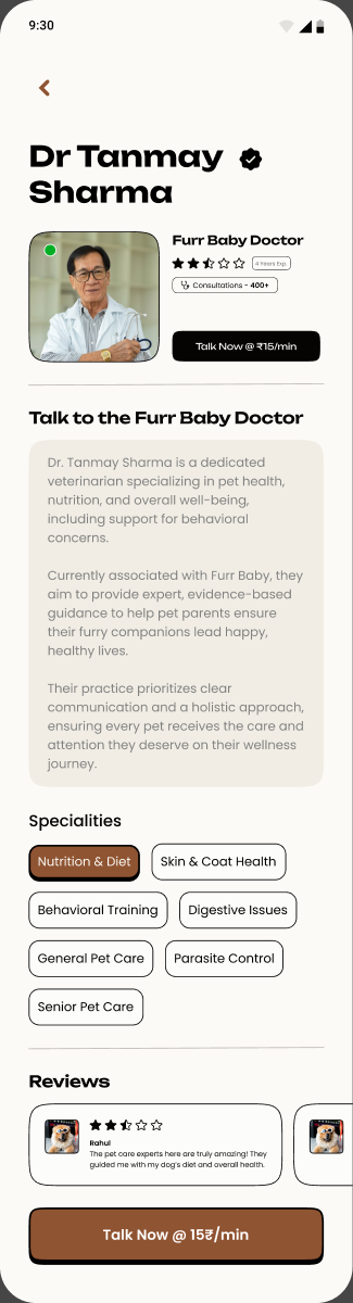
Placed against the name rather than in a credentials section further down. A trust signal that appears after the decision point is decoration. This one arrives with the first thing you read.
Not the owner's. A small decision with a large effect on framing: the product is oriented around the animal from the first line of the first screen.
The signature idea
The pet health card
- Problem
- A remote veterinary conversation starts from nothing. The owner retypes the same history every time, the doctor asks the same opening questions every time, and the consultation spends its first minutes recovering information the system already had.
- Evidence
- Owners described symptoms in their own language rather than clinical structure. Veterinarians needed history during a consultation. The phase 0 research had already shown that structured pet information changed how confident an owner felt before an interaction, and the same mechanism applies when the stranger is a doctor.
- Hypothesis
- If the pet has a persistent health identity that both sides can see, the conversation starts further along and the owner stops doing the same work repeatedly.
- Exploration
- The alternatives were a longer intake form before each consultation, which pushes the burden onto the owner at the worst possible moment, and letting the doctor pull history manually, which pushes it onto the more expensive party and only works if they remember to.
- Why this one
- It solves the problem once rather than at every consultation, and it puts the information where the decision happens. It also carries continuity, which is the part a chat transcript alone can never provide.
- Implementation
- The card became the shared layer in the ecosystem: created and maintained on the owner side, surfaced as patient context on the doctor side.
- Reflection
- The open question is maintenance. A record is only as good as its most recent update, and I have no evidence about whether owners would keep it current. That is the first thing I would want to test, and the answer would probably change how aggressively the product prompts for updates.
Which is the whole idea in six words: the profile turns a chat into a consultation.
A generic messaging interface assumes both people already have enough context to begin. Veterinary support does not work that way, so chat was positioned on top of structured pet information rather than beside it. Before the message, the doctor can already see the animal's context. During it, the owner explains what they are observing and gets guidance. When text runs out, the experience escalates to video.
Video consultation exists because a veterinarian may need to see behaviour or physical context that no description captures. The transition from chat should read as support escalating, not as a different product opening. It is also the place where the case study has to be careful: this is remote care with real limits, and it does not replace a physical examination.
Journey A, new pet owner
Step 9 of 9
The longest path in the product, and the one that has to earn every piece of information it asks for.
Journey B, returning pet owner
Step 6 of 6
Short, because the record already exists. This is the payoff for the work journey A did.
Journey D, assisted information
Step 5 of 5
Note where the path ends. The doctor is the last step and the responsible party, by design.
- Problem
- Owners describe symptoms in natural, unstructured language. Veterinarians need structured context. Someone has to translate, and doing it manually costs the professional time at the exact moment their attention is most valuable.
- Evidence
- The gap between how owners describe a problem and how a professional structures one was one of the clearest system level findings in the healthcare framing. It is also the failure mode of every remote consultation that starts badly.
- Hypothesis
- An assistive layer could organise messy owner language into a structured summary, saving the doctor the reconstruction work without taking any clinical decision.
- Exploration
- The tempting version is symptom checking, where AI suggests what might be wrong. It is also the version that is unsafe here, because a confident wrong suggestion to a worried owner about an animal that cannot contradict it is a genuinely harmful outcome.
- Why this one
- It captures most of the value with none of the liability, and it keeps the professional in the position the whole product depends on them occupying. A system that quietly shifts clinical judgement onto software is not a better product, it is a worse one with a better demo.
- Implementation
- Designed as a concept within the consultation flow, with the doctor review step as a required part of the path rather than an optional one.
- Reflection
- This was conceptual. Whether it was prototyped or implemented needs verification against the original project files, and this case study does not claim otherwise.
The principle, stated so it cannot be quietly dropped later: AI assists with information organisation. The professional remains the decision maker.
Asset needed
The before and after comparison: a generic chat opening beside a context rich consultation opening.
This is the clearest way to show what the health card actually buys, and it needs both screens exported from the original file. Building it from one real screen and one mocked up counterpart would be inventing evidence.
09 · Doctor
The veterinarian experience
A service cockpit, not an analytics dashboard, designed for the least confident user in the room.
The doctor side introduced a completely different adoption problem. We spoke with veterinarians including Mr. Ramesh, Swati and Mr. Pankaj, and their varying levels of digital confidence made something obvious that is easy to forget: professional expertise and digital fluency are not the same thing.
So the portal could not be designed for an imagined power user. It had to work for the least digitally confident professional without becoming tedious for the most experienced one. That meant guided onboarding, predictable actions, clear labels, strong hierarchy, visible progress and as few unnecessary steps as the workflow allowed.
Which reframes the whole surface: doctor onboarding is a product adoption problem, not a sign up form.
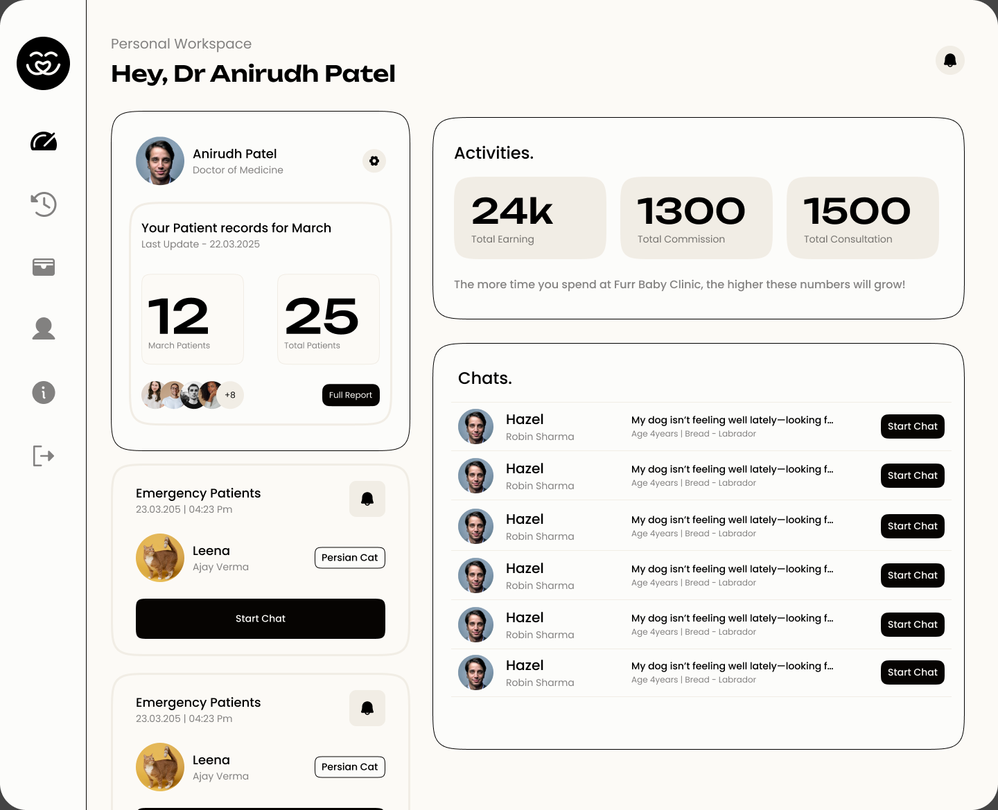
Dashboard, history, wallet, profile, information, sign out. Six destinations, permanently visible. For a user with low digital confidence, a navigation that never moves or collapses is worth more than one that is clever.
The distinction that shaped it: a doctor may need to see who needs attention, understand a patient's context, respond to a message, review records and manage service information. Those are tasks. An analytics dashboard answers a different question, and answering it at equal visual weight to the tasks would make the tool slower to use rather than more informative.
The patient record sits underneath all of it, and it does something a chat transcript cannot. It reduces repeated questions, preserves history, supports continuity across interactions and gives both sides one reference to point at.
Journey C, veterinarian
Step 8 of 8
Read pet context sits before chat or video deliberately. That ordering is the entire product thesis expressed as a sequence of steps.
Notifications
DesignedDesigned around attention rather than noise. New patient request, new message, upcoming consultation, updated patient information, follow up required. Only the states that exist in the final design should ever be documented as real.
Wallet and payments
DesignedOwners see a balance and can recharge. The doctor side carries monetary information. Financial actions are kept visually distinct from medical information, and the wallet stays a supporting utility rather than the centre of a healthcare product.
Community
ExploredPart of the broader ecosystem direction, sitting as a separate layer from the core consultation journey. Presented here as explored, not shipped, because the project record does not confirm it was fully integrated.
Asset needed
Doctor onboarding screens, the patient record detail view, doctor chat, notification states and community screens.
These were designed but are not in the exported set I have. The dashboard is doing a lot of work in this chapter on their behalf.
10 · System
Architecture, priorities and the visual system
How a two sided product stays coherent without pretending the two sides are the same.
Pet owner architecture
Home and discovery, pet profile, health information, consultation, chat, video, wallet, notifications, community, account.
Veterinarian architecture
Dashboard, patients, patient records, chat, consultations, notifications, wallet and earnings, profile, support and onboarding.
The two structures overlap in the middle and diverge at the edges, which is correct. An owner navigates by their animal. A veterinarian navigates by their workload. Forcing one navigation model onto both would have made one of them worse to serve a consistency nobody experiences, since no single person uses both products.
P0
Core experience
- Onboarding
- Pet profile
- Healthcare access
- Consultation
- Doctor workflow
Remove any one of these and there is no product. Everything else is an improvement on top of a service that already works.
P1
Supporting
- Chat
- Video
- Records
- Notifications
- Wallet
These make the core experience better and more complete, but each one assumes the core already exists.
P2
Ecosystem
- Community
- Extended discovery
Genuinely valuable, and the first things to cut. Presenting them at the same weight as consultation would misrepresent what the product is.
Scoped areas by priority tier
- P0 Core5
- P1 Supporting5
- P2 Ecosystem2
A count of the product areas assigned to each tier, taken from the project prioritisation. This is a count of scope, not a measure of effort, usage or success. The priority labels should be checked against the actual roadmap if one exists.
Principles
The seven rules the product was checked against
Principle
What it means in practice
Trust before action
Establish confidence before asking for commitment.
Context before conversation
Give the doctor useful information before the chat opens.
Progressive disclosure
Do not put every field on the first screen.
Design for proxy communication
The owner is speaking for an animal, and the interface has to account for the translation.
Different users, different simplicity
Owners need reassurance. Doctors need speed and context. Simple does not mean identical.
Technology supports judgement
AI organises information. Professionals decide.
One ecosystem
Profile, consultation, communication and payment should feel like one service.
Brand
Warm enough for pets, credible enough for healthcare
I designed the brand direction alongside the product, and it had to occupy an unusual position. Too playful and a healthcare service stops being believable. Too clinical and it stops feeling like it is about an animal somebody loves. It also had to survive being used in three places at once: a consumer app, a website, and a professional portal where a veterinarian is doing their job.
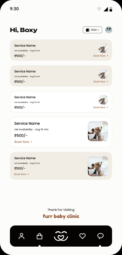
The resolution visible in the shipped screens is a warm neutral base with a single grounded brown accent, geometric type, and a mark built from two shapes that read as an animal and a heart at the same time. It sits closer to credible than to cute, and it lets the professional portal use the identical palette without looking like a toy.
Asset needed
Logo explorations, moodboards, the full colour exploration and the written brand rationale. Plus the design system itself: type scale, tokens, spacing, grid, components and their states.
The system was built, and the consistency across the shipped screens is the evidence for it. The token and component documentation has not been exported, so this case study describes the system rather than showing it, which is the weaker of the two.
Beyond the design file, the real product has constraints a Figma frame does not: responsive behaviour, component states, content that changes length, performance, accessibility, and technical limits discovered during implementation. Loading, empty and error states are where most design systems quietly fail, because they are the states nobody presents in a review.
Documenting that properly needs the development artifacts, and I would rather say that than imply a handoff process I cannot evidence.
11 · Reflection
What the project taught me
The trade offs, the things I would test next, and what stayed with me.
Challenge
How I responded
Unclear startup direction
Researched and structured the product before committing to a build.
A major business pivot
Carried the reusable learnings into the new domain instead of restarting.
The patient cannot communicate
Built structured owner input and a shared pet record.
Trust concerns from owners
Verification spread through the journey as progressive checkpoints.
The limits of remote care
Richer context, video where it helps, and explicit boundaries about what it is not.
Varying doctor digital confidence
Guided onboarding and a focused workflow rather than a feature dense portal.
High information density
Prioritisation and progressive disclosure on both sides.
The pull toward AI diagnosis
Used AI to structure information and left judgement with the professional.
The first phase taught me that a familiar interaction model becomes a very different product when the relationship between user and subject changes. A pet matchmaking app is not a dating app with animals in the photography. The owner becomes a proxy decision maker, and that reshapes identity, trust, safety and information architecture all at once.
The pivot made those lessons more consequential. In healthcare, trust is not a decorative layer. Context matters, the person entering the information is not the patient, and technology should support professional judgement rather than replace it.
It also taught me that simplicity is not one thing. A worried pet owner needs reassurance and clarity. A veterinarian working through a queue needs speed and context. Designing one interface that serves both would have served neither.
The line I keep coming back to: when the user cannot explain the problem themselves, the interface has to work harder to preserve context.
- 01
Research at the level of the problem
Findings tied to a feature die with the feature. Findings about how people build confidence survive a change of category, which is exactly what happened here.
- 02
Proxy users change the information model
Not just the copy. If the person filling in the form is not the person the form is about, the whole structure underneath has to account for the translation.
- 03
Adoption is a design problem
The doctor portal could have been designed for a confident user and quietly excluded a third of its intended audience. Treating onboarding as an adoption problem changed what got built.
- 04
Restraint is a feature in AI
The version that suggests diagnoses demos better and is worse. Deciding what a system should not do is as much design work as deciding what it should.
- 05
Placeholder numbers are a trap
The dashboard carries figures that look like results and are not. Labelling them honestly costs a sentence and is the difference between a credible case study and a discredited one.
- 06
A record is only as good as its upkeep
The health card is the strongest idea here and it has an unproven assumption inside it. That is the first thing I would test.
Outcome
What changed, stated honestly.
- 01
A complete pet matchmaking direction explored, including the interaction research, the trust model and the owner facing screens
- 02
A business pivot absorbed without discarding the research, with six areas of phase 0 learning carried directly into healthcare
- 03
Trust designed as a sequence of checkpoints through onboarding rather than a single verification wall
- 04
A pet health card established as the shared context between owner and veterinarian, which is the idea the rest of the healthcare product stands on
- 05
Both sides of the ecosystem designed, an owner app and a veterinarian service cockpit, over one shared record
- 06
Doctor onboarding treated as a product adoption problem, designed for the least digitally confident professional
- 07
Chat and video connected to contextual information rather than sitting as standalone features
- 08
An AI assisted summary concept incorporated with the professional explicitly retained as the decision maker
- 09
A brand direction and reusable UI system that works across a consumer app and a professional portal
On metrics
These are design outcomes, stated qualitatively on purpose. I have no verified figures for users, consultations, adoption, retention or revenue, and the figures visible on the dashboard screen are placeholder values from the design file rather than business results. Which parts of the product reached production also needs confirming against the original project files. If real launch data becomes available, it belongs here and nowhere else.
Good product design does not simply give people more features. It gives them enough clarity and confidence to make the next decision.