Case study
Women's digital healthcare
Livegracious
Making a healthcare product feel safe enough to use, before asking it to be useful.
A women-first healthcare ecosystem designed around continuity rather than appointments. I worked as Product Designer in an agency team, shaping the architecture, journeys, personas and design system, then designing both the patient app and the professional side behind it.
Three ways to read this. Pick the one that fits the time you have.
- Role
- Product Designer
- Duration
- Mumbai, about two months
- Team
- Agency team, working closely with the Product Manager
- Scope
- Product discoveryBehavioural researchPersonas and journeysInformation architecturePatient onboardingProvider discoveryPatient dashboardDoctor onboarding and dashboardCommunity and educationDesign system
In four lines
The reframe
Not how do we help a woman book a doctor, but how do we help her manage her healthcare story with confidence.
The real problem
Not access. Continuity. A health story that resets at every clinic, every specialist and every new form.
My role
Product Designer in an agency team, working with the Product Manager who held the client and business context.
What made it hard
The complexity was human, not technical. The person searching for a doctor may be anxious, embarrassed, or carrying something she has never comfortably said out loud.
01 / 11Overview
01 · Overview
A woman is a whole person, not a diagnosis
The belief the product was built on, and the sentence that shaped the whole story.
You explain your symptoms so many times, you stop expecting anyone to really hear them.
This is the emotional gap the product was trying to close. Healthcare can be technically available and still feel fragmented, repetitive and impersonal.
Live Gracious is a women's healthcare application designed as a companion to the healthcare journey rather than another appointment booking tool. It brings doctors, medical information, appointments, prescriptions, reports, education and community into one connected experience.
The larger ambition was continuity: connecting information across specialists, across years and across life stages, instead of letting a woman's healthcare story fragment between clinics, documents and conversations she has to repeat.
The central question: how might we create a healthcare environment where a woman feels safe enough to share what is really happening?
The second half matters as much as the first. Feeling safe is not the goal on its own. It has to lead somewhere, which means a clear path toward care.
- 01
Trust
Users should feel confident before sharing sensitive information, not after.
- 02
Credibility
Doctors and health information should be legitimate and transparent about why.
- 03
Privacy
Sensitive conversations need explicit reassurance and clear boundaries.
- 04
No judgement
A woman should be able to speak openly without feeling evaluated.
- 05
Continuity
A health story should travel with her, not reset at every appointment.
- 06
Clarity
The interface should reduce uncertainty, not add to it.
- 07
Whole-person care
She should never be reduced to a single diagnosis.
- 08
Two-sided trust
Patient confidence depends on the credibility of the professionals behind the platform.
These were not extracted from a market feature list. They were convictions the team held about what women deserve from healthcare, written down before the architecture, and they are the reason the product reads the way it does.
02 · Problem
The problem was not access. It was continuity.
What breaks when a health story lives in six places and none of them talk.
A woman's healthcare journey can involve multiple doctors, specialists, laboratories, prescriptions, reports, appointments and deeply personal conversations. Each of those pieces can end up living somewhere different.
That framing changed what the product had to be. An appointment booking flow solves access. It does nothing about the fact that the fourth doctor knows none of what the first three were told.
Repetition
Sensitive information gets told again and again, and each retelling costs something.
Uncertainty about who to see
Finding the right doctor involves judging expertise and credibility with very little to go on.
Hard things are hard to say
Sensitive health topics are difficult to raise, and an interface can make that easier or considerably worse.
Unclear handling
Users need to understand what happens to the information they share, before they share it.
Clinical overload
Healthcare interfaces routinely drown people in operational and clinical detail.
Community without safety
A community is only valuable when the environment feels safe enough to participate in.
So the question stopped being how can we help a woman book a doctor, and became how can we help her manage her healthcare story with confidence.
03 · Research
Two kinds of trust
The distinction that turned out to organise almost every decision in the product.
The team combined client context, product discovery, behavioural research, personas, journey mapping and competitive benchmarking. The goal was to understand not only what users need to do, but what they need to feel before they are willing to do it.
- 01
How do women manage fragmented healthcare information today?
The baseline. What the product would be competing with is not another app, it is a folder and a memory.
- 02
What makes a healthcare platform feel trustworthy?
And, more usefully, what makes one feel untrustworthy, since that is the faster signal.
- 03
What is needed before choosing a doctor?
The information that turns a name in a list into a person you would tell something difficult.
- 04
How comfortable are women sharing sensitive information digitally?
Comfort is not constant. It varies by topic, by moment and by what the product has done to earn it.
- 05
What makes a community feel safe enough to join?
Participation is the outcome. Safety is the precondition.
- 06
How much should onboarding ask for at the start?
Every field is a request, and early requests are the most expensive ones.
- 07
Where does healthcare complexity create needless load?
Much of what these interfaces show exists for the institution, not for the person reading it.
The most useful thing the research produced was a split: functional trust and emotional trust are not the same thing.
Functional trust is credentials, records, clear appointments, transparent information, reliable service. Emotional trust is feeling heard, respected, safe, understood and in control. A product can have all of the first and none of the second.
Functional trust
The moment
Emotional trust
Every row is one point in the journey. The left column is what the product must prove; the right is what it must make her feel. Hovering either side lights its counterpart. Designing for only one column is the common failure, and it is why a healthcare flow can be technically flawless and still not get used.
Which gave the project its north star: if the user does not trust the product, even a beautifully designed healthcare flow fails.
The benchmark work covered healthcare, doctor discovery, health record, women's health and community experiences. It looked at information architecture, how doctors are represented, how credentials are communicated, how medical information is organised, how sensitive actions are framed, how community rules are surfaced, and where users hit information overload. It deliberately did not look at visual style, which is the least transferable thing in a benchmark.
Content needed
The exact competitor names and the screenshots from the original agency research board.
The benchmarking happened and shaped the architecture. Listing plausible-sounding competitors here would be inventing research, so the categories reviewed are named and the products are not.
04 · Kajol
The persona that changed the question
Her diagnosis was not the interesting part. The hesitation before disclosure was.
Kajol
Persona
One of the personas used in the project: a teacher who had been diagnosed with PCOD, and who was not naturally comfortable sharing every detail of her health experience.
- Work
- Teacher
- Health context
- Diagnosed with PCOD
- Disposition
- Private about sensitive experiences
- Needs reassurance before sharing
- Values confidentiality
- Expects respectful communication
- May hesitate on certain topics
- Participates when safety is clear
- Finds value in shared experience
The tensionShe would participate, and would find real value in learning from women with similar experiences. But only once the platform had clearly communicated that it was safe to. The gap between those two states is where the product either works or does not.
The question she changed
Before this persona, the team asked: What information do we need from her? After it, the team asked: What does she need to feel safe enough to give us that information?
Kajol is a persona: a synthesis built from the project's research, not a participant who sat in an interview. The distinction matters, and her details should be verified against the original agency notes before this page is published.
A woman discloses only what she believes will be handled respectfully. Around reproductive health, personal symptoms and relationships, that calculation is running constantly. So before asking for anything, the product had to establish why it was being asked, how it would be handled and who would see it.
Which makes trust structural rather than decorative. It is not a layer added to onboarding. It is the precondition that makes the rest of the healthcare experience possible.
05 · Journey
Three questions, in order
The whole product laid out as the sequence of things a user is actually asking.
Can I trust this place?
Nothing useful can happen until this is answered. The phase moves from low-risk information toward more sensitive information, so the relationship builds gradually rather than opening with a demand for personal health data.
- Splash
- Login or register
- Eligibility
- Contact information
- Identity verification
- Optional uploads
The order is not a workflow diagram, it is an emotional sequence. Trust, then disclosure, then care, then continuity. Read the steps without the phases and the ordering looks arbitrary. Read them inside the questions and each step is either earning the right to ask for the next thing, or spending the trust that was earned.
Onboarding
Establish enough, and no more
Patient onboarding
Step 8 of 8
Deliberately short. The goal was identity, eligibility and enough context to make the dashboard useful, without turning the first interaction into a long medical form. The two uploads are optional on purpose: they are the highest value and the highest friction steps, so they sit at the end where declining them costs nothing.
Content needed
The exact identity verification method and its legal and compliance context.
The original project conversation described a specific national identity document as part of this flow. Naming it as a shipped product claim without confirming the compliance context around it would be exactly the kind of statement that should not appear in a public case study.
06 · Architecture
Two structures, one system
Defined early, because the product was always broader than an appointment flow.
Patient architecture
Dashboard, providers, appointments, medical records, prescriptions, lab reports, articles, community, notifications, profile and settings.
Doctor architecture
Onboarding, credential verification, dashboard, patient requests, appointments, patient history, consultation, notes, profile, notifications.
The rule the structure was checked against: navigation should reflect the user's mental model of care, not the company's internal organisation.
Architecture came before screens because the product had to support discovery, healthcare management, records, education and community without any of it feeling like separate products bolted together. That is an ordering problem, and ordering problems get much more expensive once there are interfaces to unpick.
Cognitive load
Healthcare is demanding before anyone reaches a doctor
Clear hierarchy
One obvious thing to read first on every screen.
Shorter decision paths
Fewer steps between intent and action.
Progressive disclosure
Detail available, not compulsory.
Grouped health information
Related things kept together so nothing has to be hunted for.
Plain-language labels
The interface should not require clinical vocabulary.
Visible status
Confirmation states that leave no ambiguity about what just happened.
Separated content types
Clinical, educational and community content kept distinct.
Consistent components
Predictable patterns cost less attention to use.
Consistent navigation
The same thing in the same place, every time.
Stated as a principle: the user should not have to understand the healthcare system in order to understand the interface.
07 · Patient
The patient experience
A dashboard as a calm personal workspace, and provider discovery as a trust decision.
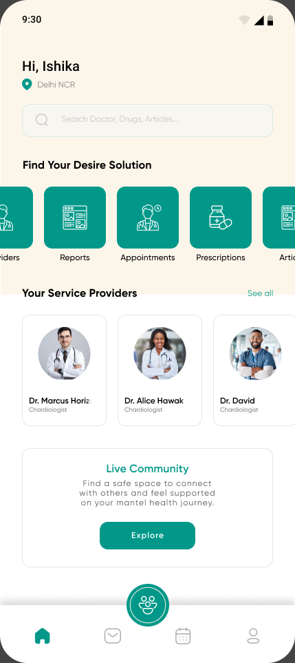
The first thing on the screen is her name and where she is, not a metric or a health score. The opening frame is a person, which is the whole product thesis in one line of type.
Finding a doctor is the most trust-sensitive moment in the journey. She is not choosing a name from a list, she is deciding whether to trust someone with information she may never have said out loud. So the provider profile carries qualifications, specialisation, professional experience, current professional information, location and availability, and it carries them before the booking action rather than after it.
Appointment booking was then designed as a continuation of that trust journey rather than an isolated scheduling feature. In a sensitive healthcare product, the confirmation button should never be the first moment the user understands what is about to happen.
- Problem
- Provider lists usually optimise for conversion: show enough to be appealing, put the detail behind the booking screen, reduce the steps to commitment.
- Decision
- Give the user enough context to make an informed choice before asking her to book.
- Reasoning
- That pattern works when the decision is low stakes. Here the decision is whether to disclose something difficult to a stranger. Removing the information that supports that decision does not remove the hesitation, it just moves it to after the booking, where it turns into a cancellation or a consultation where she says nothing real.
- Impact
- Qualifications, experience and availability became part of the profile rather than part of the confirmation, and the booking flow reviews provider information as an explicit step.
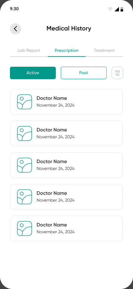
Lab reports, prescriptions and treatments live under a single medical history rather than as three separate features. The mental model is her history, and the document type is a filter within it.
The community was intended as more than a forum: shared experiences, peer learning, health education, emotional reassurance and a reduced sense of isolation. The stated challenge was balancing openness with safety, because a community only becomes useful once people feel comfortable participating.
That challenge is not yet visible in the exported screens. What exists is browse and join. The boundaries, moderation and participation rules that the safety argument depends on are not designed in the version I have, and the placeholder titles show how early these screens are. Presenting them as a finished safe space would overstate them.
The intent, which the screens have not caught up with yet: more than a community, a judgment-free space where women can feel authentic enough to talk about what they are actually going through.
08 · Doctor
The professional side
Trust has to work in both directions, so doctor onboarding is part of the patient experience even when the patient never sees it.
If patients are expected to trust doctors, the platform needs a credible process for bringing doctors into the ecosystem.
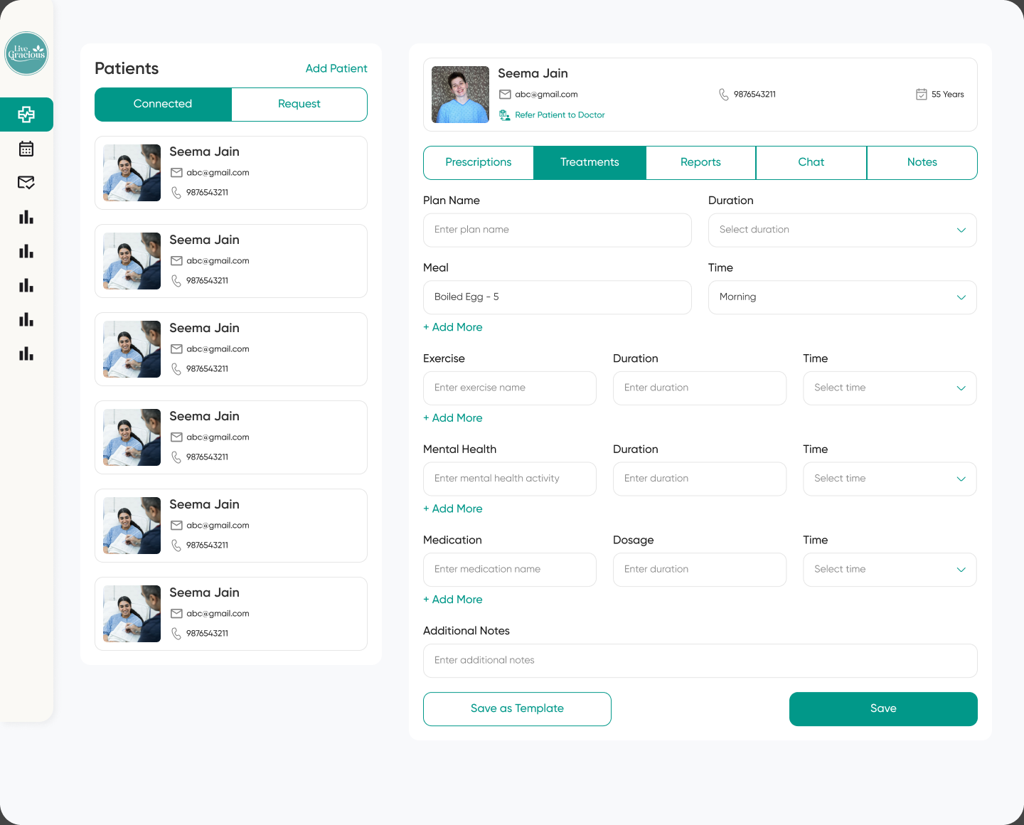
Existing patients and inbound requests are separated at the top of the list. Two different jobs with two different urgencies, kept from competing for the same attention.
Which is the clearest thing in the project: whole-person care survived all the way down into the form fields.
It is easy to write that a woman should not be reduced to a diagnosis. It is harder, and much more convincing, to give mental health the same visual weight and the same controls as medication in the screen where the doctor actually works.
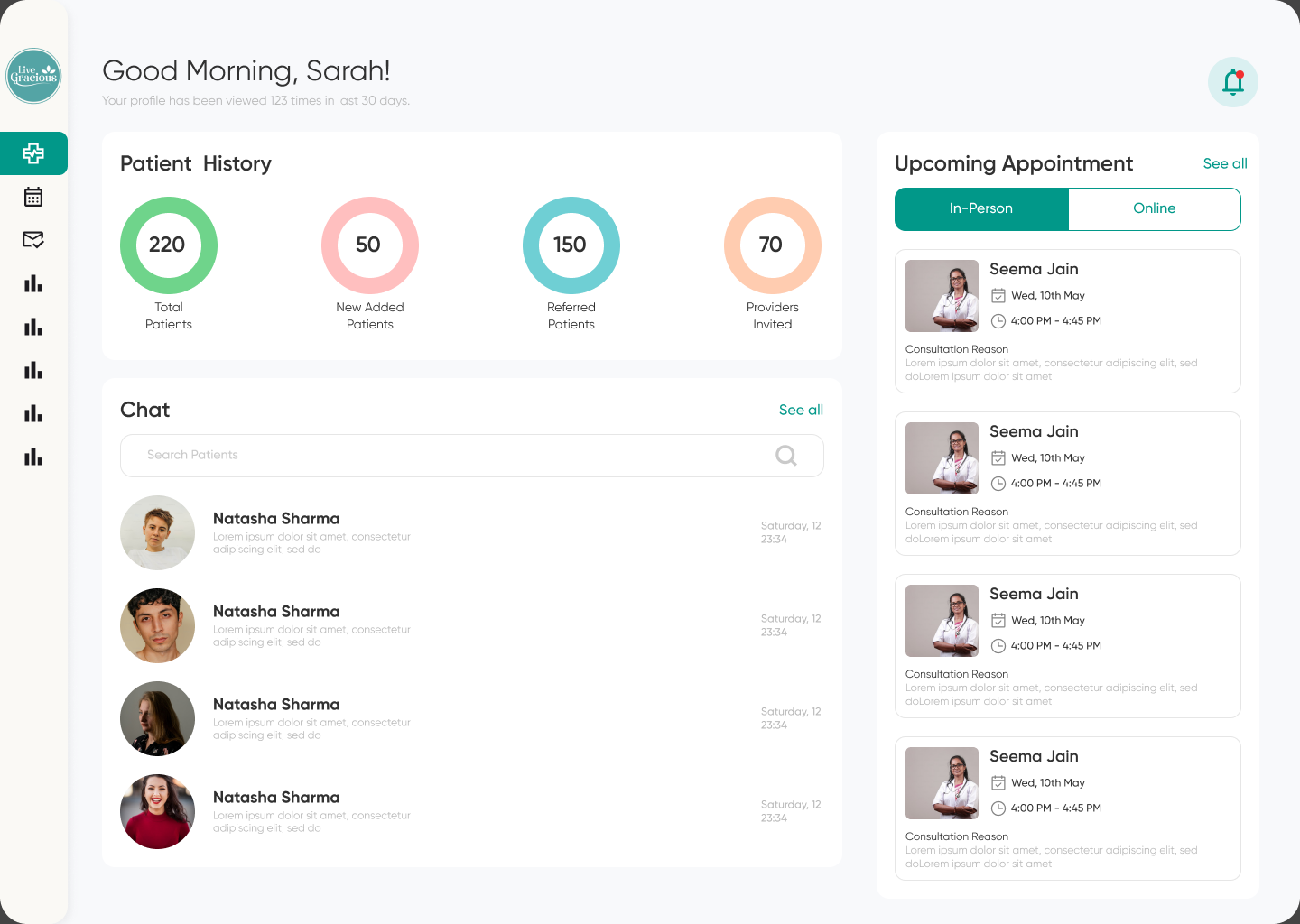
The profile view count shown here is a placeholder value from the design file, not a measured result. This case study does not present it as one.
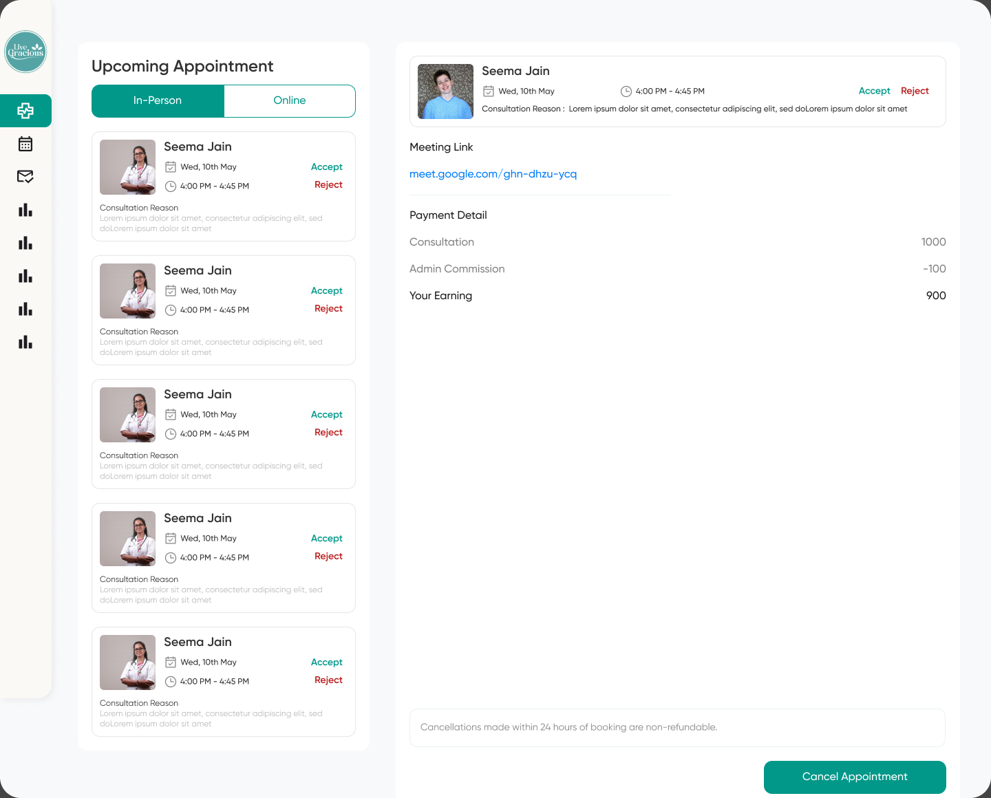
The same split as the dashboard, carried through consistently. A pattern that changes meaning between screens costs more than it saves.
The doctor's loop
Step 7 of 7
Review patient context sits second, before the accept decision. The doctor is given the information to make a judgement before being asked to make one, which is the same ordering principle the patient side uses for provider profiles.
09 · Privacy
Privacy as a UX problem
Not a footer link. A mechanism that changes the emotional context of an interaction.
The product explored explicit declarations around sensitive conversations: clear language, before the interaction, explaining the intended confidentiality and handling of what is about to be said.
A short, clear statement changes what the user is being asked to do. Without it she is being asked to blindly trust an unknown system. With it, the product has stated the behaviour it expects of itself, and she can decide whether to proceed against something specific rather than against a feeling.
Which is worth being precise about: this is a product trust mechanism, not a security claim.
This case study does not claim encryption, regulatory compliance or any security certification, because none of those were verified. A declaration that sets expectations is a design decision. Stating it as a technical guarantee would be a different and unsupported claim.
Asset needed
The consent and declaration screens, with their final wording.
This is the mechanism the chapter is about and it is the one thing I cannot show. The exact wording also needs review by legal and clinical stakeholders before it appears publicly.
10 · System
The design system, and the visual line it had to walk
Consistency in healthcare is not polish. It is a form of cognitive support.
Once the architecture and primary flows were settled, I worked toward a consistent system so the product could scale without every screen becoming a one-off: typography hierarchy, colour, spacing, grid, buttons, inputs, cards, navigation, provider components, health information components, status states, notifications, community components and consent patterns.
In healthcare that consistency does more work than usual. A predictable interaction pattern is one less thing to decode, and users of this product are frequently decoding a great deal already.
Avoid
Aim for
Overly clinical
Calm and credible
Overly playful
Warm but mature
Information-heavy
Structured and breathable
Fear-based language
Reassuring clarity
Generic healthcare feel
Human and women-first
The resolution visible across the screens is a single deep teal carrying every primary action, a warm off-white ground rather than clinical white, generous card spacing, and rounded geometry throughout. The teal is doing double duty: credible enough to read as healthcare, warm enough not to feel like a hospital system.
Asset needed
The design system itself: type scale, colour tokens, spacing, grid, component states and variants. Plus the personas, journey maps, wireframes and the research artifacts.
The system was built, and the consistency across ten exported screens is the evidence for it. Describing a system is weaker than showing one, and this chapter is currently doing the weaker thing.
11 · Reflection
The complexity was human
What the project was really about, and the nine things I would test next.
Challenge
What I learned from it
Sensitive information
People disclose when they understand the relationship, not when they are reassured in general terms.
Fragmented healthcare
Continuity can be a product feature rather than an administrative aspiration.
Doctor credibility
Trust has to work on both sides, and the side the user never sees still shapes their experience.
Information density
More information does not mean better UX, especially when the reader is anxious.
Community safety
Openness needs structure. A space with no boundaries is not a safe one.
Business and user needs
The strongest decisions came from discussing both together rather than in sequence.
Live Gracious was not the most technically complicated product I have worked on. Its complexity was human. The difficult part was never the doctor search screen. It was deciding how the experience should feel when the person using it may be anxious, embarrassed, uncertain, or carrying information she has never comfortably shared.
That changed the small decisions: the words in onboarding, how much is shown at once, how visible credentials are, how the dashboard is structured, what role community plays. A user can technically book a doctor in three taps and still have a poor healthcare experience, if she does not trust the system enough to tell that doctor what is actually wrong.
It also taught me that continuity is not a database problem. It is an experience problem. When information is connected, the user should feel that the system remembers her context, not that she is starting from zero again.
The real design problem, stated plainly: make a healthcare system feel safe enough to use before asking it to become useful.
- 01
Test the consent explanations
Different privacy and declaration wordings, measured against whether people actually understand what they mean.
- 02
Find where onboarding loses people
Measure hesitation step by step rather than assuming the sequence is right.
- 03
Test how much provider information is needed
The current answer is a judgement, not a finding.
- 04
Check comprehension of data handling
Whether users understand what is stored and who can access it, which is different from whether they were told.
- 05
Study community moderation needs
The safety argument requires mechanisms that are not yet designed.
- 06
Test continuity across appointments
The core promise, and the one that only shows up on the second and third visit.
- 07
Explore longitudinal health timelines
A natural extension of the record work, currently unexplored.
- 08
Validate accessibility and readability
Across age groups, which this product spans more widely than most.
- 09
Validate sensitive flows with specialists
Legal, clinical and security stakeholders, before any of this handles real health data.
And the sentence I would want someone to remember: a woman should not have to become an expert in the healthcare system to feel in control of her own health.
Outcome
What changed, stated honestly.
- 01
A women-first healthcare information architecture, covering both the patient and the professional side
- 02
End-to-end patient and doctor journeys, structured around three emotional phases rather than a feature sequence
- 03
A trust-led onboarding flow that moves from low-risk to sensitive information rather than opening with a medical form
- 04
Provider discovery and appointment booking designed as a single trust decision, with credentials placed before the commitment
- 05
A patient dashboard that acts as a calm personal health workspace rather than an analytics screen
- 06
Doctor onboarding and provider-side workflows, including a treatment plan builder that treats mental health as a peer of medication
- 07
Reports, prescriptions and medical history integrated into one continuous record rather than three separate features
- 08
Community and educational content designed as part of the care model, though the safety mechanisms remain unresolved
- 09
A reusable design system, and a visual direction that reads as credible without reading as clinical
On metrics
These are design outcomes. I have no verified figures for usability findings, task success, adoption, engagement, appointment conversion or retention, and whether the product reached concept, prototype, MVP or launch has not been confirmed. The figures visible on the doctor screens, including the patient counts and the payment breakdown, are placeholder values from the design file rather than results. Before this page is published, the agency and client disclosure rules, the persona details, the verification method and the consent wording all need checking against the original project record.
Because healthcare should not ask women to start their story again every time they need help.